I recently came across Printed Village, (did you know about it? And if so, why have you been holding back on me?) And? Of course, I have decided to partipate in one of their challenges. This site offers ‘story boards’ and deadlines for a surface design artists to create work on a theme, with prizes. Reread that last sentence. What more could a girl ask for? I have been wanting to design around the theme of NYC since I began Free Range Textile Printing, last summer. The theme of this challenge is specifically asking for artwork on the theme of the New York City Subway.
At the same time, Carol Soderlund and I are hosting a Print-Along. (Please join in!)
So. I have decided to combine posts, because these two pursuits dovetail so nicely.

I love working with repeat. I have chosen to work with the 6″square because across the spectrum of art materials used, carving rubber, fun foam, and Plexiglas, all are sold in increments of 6″.
In addition, so much information can be depicted in this size and format, it is suprising.
In Playful Fabric Printing we describe using a square repeat (Playful Fabric Printing, page 26) and personally, this has been a good, ‘go-to repeat’ since creating artwork for the book. It is an easy and straight forward repeat to do.
But, there are many types of repeat out there. Each provides attributes that work well for specific end goals. Florals can look really good in a five point repeat, for example. We all know the clamshell repeat and how we might use them in quilt tops. And of course, there is the all over repeat, which works well, over-all! 🙂
Of course, it does.
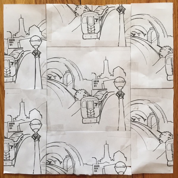
After compiling the above square repeat, I scanned, printed and taped 4 copies (Playful Fabric Printing, page 29) together, to evaluate the design.
And?
I don’t like it! I think it is heavy, clunky, and unappetizing. For the end goal of fashion wear, I think it needs a ‘visual lightening’, an aeration of motifs, if you will. I definitely want my design to illustrate iconic subway related imagery, which is what I perceive is being asked for. And, frankly, I would love to have an element of graffiti in there, but words make people read, and fashion-wise, not everyone wants to be read while-being-fashionable, so back to the design table I go.

I cleaned up the motifs that were holding me back and began to redesign within a Half Drop Repeat. This -I feel-, opens up design possibilities and gives space to drop in a new motif (or two). I need motifs that say ‘NYC Subway’ -to best advantage-.
This repeat is, as yet, unfinished. I will update you on my progress throughout the next week or so.
I really look forward to carving it!!
Discover more from Melanie Testa
Subscribe to get the latest posts sent to your email.

I think the half drop has a lot of potential. Looking forward to developments.
LikeLike
I love the original idea. It would look great on a tee or tote bag. I also see why you thought it was to clunky. The half drop design is wonderful. I like the contrast of straight lines and the curves. Looking forward to where you go next with this design.
LikeLike
It’s going to be very cool.
LikeLike