artful reboot

For a long while, perhaps a year or more, I have been having a hard time artistically. I needed to get a part time job, and I did. Its a good job, I like it. As in most things I do, I jumped fully into the job, started taking more hours, I began volunteering for more work. Until I felt a huge void. I was experiencing a lack of focus on my own art, and it hurt my feelings. I became disconcerted. Grumpy. I made things, but nothing was stirring the well.

So what do you do when making art has become difficult? How do you reconnect with your art and begin engaging with it in a manner that bolsters and supports making? Often, in the past, I have changed media, swapping out dye for watercolor and paper. This time, I have begun cleaning (I am destashing and selling on Etsy, please check it out). Cleaning is magical, it moves energy and makes way for different things to come forward. I love cleaning. Then, a few weeks back, my good man and I went to see the David Wojnarowicz: History Keeps Me Awake at Night. As we walked through the galleries at the Whitney, I was amazed at what we saw and touched to my very core at the depth and veracity of that mans’ work. I felt the spark of the burning creative fire, that I have been longing for. I could see a pathway to my own creative endeavors forming. I listened.

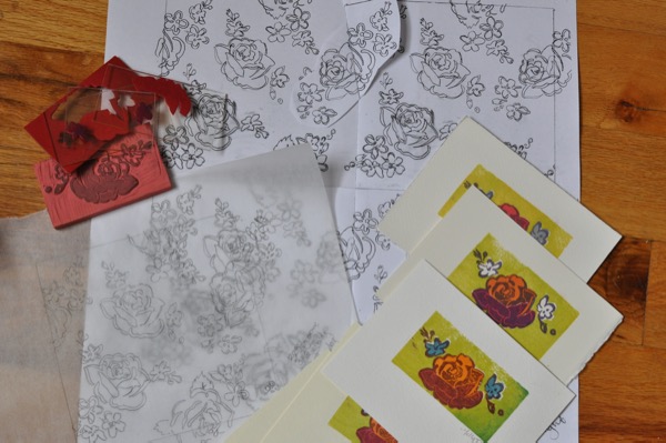
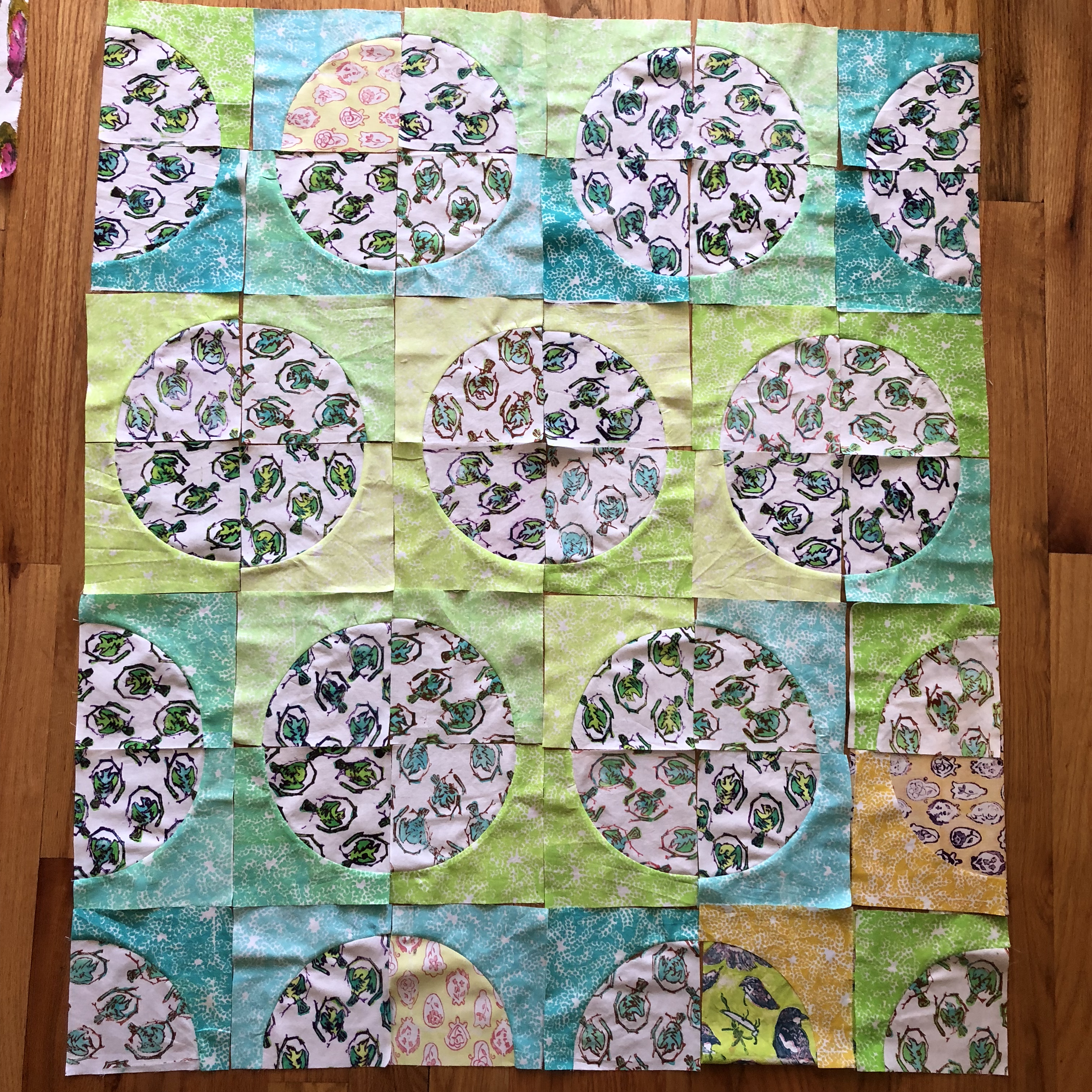
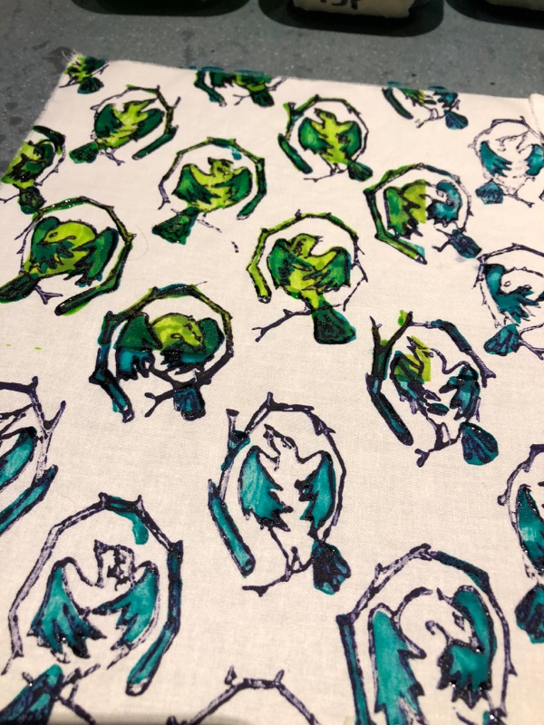
So, when I got home, I soda soaked cloth. Searched out imagery that I have been wanting to work on. Cut some freezer paper masks. I cleaned, and got ready to let the creativity flow. Geez, it feels good to turn a corner.

Please check out my Etsy! I would like to continue to make space for this change. There are artworks, purses, a bolt of fabric, and other supplies and all are priced to move. Help me make more space for change! Thank you.

Handprinted Dharma Trading Unitard

This fabulous project taught me lots and lots. There are a few aspects of this project where I will continue to find and apply solutions to perceived problems.

I started by printing a small swatch of cloth, just to see if my color choices were pleasing.

The Unitard is a  ‘clothing blank’, made of cotton jersey, procured at Dharma Trading. I love it. The medium size fits my body well, I am 5’2”, weighing roughly 130 pounds. The gathering at center front is pleasing and easily printed over. The plunging back is a fun addition to the design. The legs are about 6” too long, which I think is a great addition to this piece-as yoga clothing goes, allowing you to pull the excess length down over your ankles and heels. My one complaint is that the bodice is slightly long, although this may just mean, I am short  🙂

I decided to Playful Fabric Print the Unitard in an all-over design that contains Roses and Forget Me Nots. The repeat is a six inch square (Page 26, Playful Fabric Printing), the multicolor print set (Page 29) contains a total of 5 possible layers to print. The Rose and Forget Me Nots were carved from Eko Carve, and the additional color separations were printed using plexiglas mounted, sticky back, fun foam stamps (Page 63). This was printed using thickened Procion MX Dyes (I swapped out Turquoise Blue, Fuchsia, and Lemon Yellow dyes when mixing color numbers 2 (an Orange), 15 (Teal) and 22 (Red). I did this because I wanted bright colors (see the value bands on page 57 of Playful Fabric Printing).

My one hesitation in printing this, is the need for an insert or form, as I discussed in this post. I traced the Unitard out onto an opened cardboard box, including an additional 3-4″ to stretch the knit jersey and separate the front from the back. 

Recycling a cardboard box meant there were folds in the cardboard. Those folds were nearly impossible to print over. I had to fudge, add thickened dye with a brush and make due on this account. It’s nothing major, the print is pretty forgiving. Also, the Unitard, stretched over a full length form was a bit ungainly to manage on my small print table. But, oh well, it was necessary. 

And, I have two more Unitards to print!

Next time, I am going to try printing with Thermofax, as I think the color saturation with be super pleasing. Overall, I think printing on clothing blanks is something I am going to thoroughly explore! When I bought these babies, I also bought a skirt, a camisole and I recently dug out a tunic and a kimono (similar to this one) from my stash.

Stay tuned to more printing on clothing blanks!

SaveSave

SaveSave

SaveSave

SaveSave

SaveSave

Unitard and dressing a piece of cardboard

I have been wanting to print clothing blanks for a while. Luckily, Dharma Trading carries many styles and options and they have all the kinks ironed out. Their blanks have been tested for acceptance of dye, even the threads used to sew the garments have been considered and addressed. That’s where I found this Cotton/Spandex Unitard. If you head over there, check out the tie dyed, unitard wearing yogi in the images.

I won’t be tie-dyeing this though. In printing this, I assume I will come across some challenges. Submerging cloth in dye is much different than applying thickened dye to cloth. Much of my experience in printing is based on printing cotton broadcloth, which is woven and smooth. Knit jersey is also smooth, but the cloth is thicker and stretchy. 

Luckily, I bought three unitards, so I have some wiggle room to mess up and try again.

My first step was to cut a form out of cardboard. I made this slightly larger than the unitard, so that I could stretch the cloth some. I imagine this may help the printing to appear darker, as the cloth will be spread out in order to print it, then will retract when taken off the form. My hope is that I am not stretching the cloth too much. 

I imagine the shirring and binding on the bodice will be hard to print well and I accept ahead of time, that this may be wonky. We will soon see. Wish me luck.

SaveSave

SaveSave

The Final Carve?

This has been an interesting repeat to carve. I love floral motifs and roses printed on cloth. Carving a rose by hand is a great challenge.

Drawing and depicting roses is not easy, there are so many curved petals! Then, you need to figure out how to carve it in an elegant hand. I like to carve in stages, printing a copy at each major stopping point. In this case, I printed on both copy paper and cloth, so that I could evaluate the printed artifacts. It turns out, I want to see some shaded areas on the dark half of each rose.

Now, I prepare to remove the last bit of shading in the rose. I am plotting my course and thinking through how to go about it. I really like this carving and I do not want to mess up!

Wish me luck. 


Finding the lines through the drawing.

I love carving rubber. My mind and body reduce to nothingness as I watch the blade slip beneath the surface of the rubber, butt up against the pencil mark and lift the rubber away. I become calm and centered, my mind lets go, and I am free. It is bliss.

I begin by carving away the ‘bright’ half of each rose. I have not resolved how I would like the ‘dark’ half of the flower to be carved. I will leave that alone until I have a vision. So, there is tension and hope for a great outcome.

Life is good. How about you? Tell me about you.

SaveSave

SaveSave

What do Amanda Palmer, Jasmine Power and mail art have to do with one another?

This is one of those days that I have so much excitement, my blog post goes in two directions.

First, I participated in a video shoot with Amanda Palmer and Jasmine Power for a song called, Mr Weinstein Will See You Now. The subject matter of which, is deep, poignant, and timely with a transformative power.

I am a member of the ‘Weinstein Chorus’, one of 50 women, dressed in white shirts, who sing and run in different scenes. Lyndsay Katt plays a part too (remember my Genderless Fae debut? Lindsay pointed me in the direction of this amazing opportunity while participating too). Amanda and Jasmine’s song has been released, you can get a copy of it off Amanda‘s website. Soon, the video will come out too.

To participate in this video was to heal my person. I have been crying tears and processing what my participation has stirred within me, which is tiring, if good work. I pray the sheer magical and poetic beauty in this video, will fling itself out into the world and help heal the wounds we women carry. I feel so grateful to play a small part. Amanda Palmer and Jasmine Power are fierce females with a huge vision.

I have returned home to work with a 6″ repeat utilizing the Rose and Forget Me Not motifs. In exploring how to carve these flowers, I carved a single motif, upper left. These exploratory findings are rich for playing around with how to color the design. While playing around with this, I printed several postcards, which you can see at lower right.

Because I love mail art, I placed these postcards in my Etsy. If you purchase a 5$ handprinted postcard, I will address it to you (or yours), place a Priority Mail stamp on the card and write a message to you, prior to placing the postcard in the mail. I hope you want a postcard! I would love to write to you.

I printed a postcard for Amanda, provided a stamp and pen, while suggesting she write to herself-I felt too shy to ask her to do it right then and there. I hope she does, though. It will feel complete to me, when that happens.

As I am feeling life deeply and well, I will retreat for a while and delve into carving my next repeat. I look forward to be able to print this!

SaveSave

SaveSave

SaveSave

SaveSave

SaveSave

SaveSave

SaveSave

SaveSave

SaveSave

SaveSave

SaveSave

SaveSave

SaveSave

SaveSave

SaveSave

SaveSave

Bird Buta Baby Quilt needs a border.

I am fairly sure, I will stick with the above layout.

But, I think it needs a border. I envision that each corner needs to be a complete circle and that some darker value Single Color All Over Prints are necessary to create contrast.

So, I set to work printing more cloth, to help get the job done.

My PJ bottoms kinda go nicely with the prints, yes? 🤪

I printed 20 Single Color All Over Prints and 4 additional Bird Buta Prints. I will steam and boil them this coming Thursday, just in time for Quilt Lab. 

This has been a fun endeavor. 


Bird Buta Baby Quilt?

It is such fun to come to the making of the thing! You may remember when I was carving the Bird Buta motif or the printing of the Bird Buta. If you don’t, head over there and check it out. There is a great video in the first of the two links in this paragraph.

Just this week I steamed and washed a batch of the Bird Buta handprints. Then, I cut and pieced them. Now, I play around with design and placement of blocks.

—->The sneaky thing is, I just joined Gotham Quilts, Quilt Lab-which I love! Each month we explore a topic, go home, make something related to the topic and return to share it with the group. This month’s topic is value. (Technically they asked for polychromatic value exploration. But the polychromatic part dropped out of my mind before I started printing.) So, I have explored value in textile printing and quilt making. <—-

When I print cloth for a quilt, I like to work with value gradation, while also maintaining a modest palette of colors. In the case of these fabrics, I chose three colors-25 (Purple), 15 (Teal) and 3 (Lime) (Playful Fabric Printing page 57).

The line drawing of the bird is printed in 25D, while the bird bodies are overprinted using differing values of colors 3 and 15 in either Pale, Light and Medium.  For a total of 20 Bird Buta prints and 20 single color all over prints.

The single color all over prints used up all values mixed in colors 3 and 15 after printing the Bird Buta. In choosing these colors, I hoped for a soft, playful and approachable palette that could also be gender neutral.

I left the background of the Bird Buta print white, in the hope of creating a contrast between the focal print and the single color all over design. I am happy with how this aspect came out. 

I think the single color all over prints give the quilt top a patchwork like effect, while maintaining a meaningful color relationship between the blocks. I also think the variation in value and hue is pleasing while lending contrast depth and pop to each of these layouts.

This last photograph seems to be my preferred layout thus far. But, I envision a border… that needs -some- darker value all over single color prints. In 3 and 15 and maybe some beautiful blue? We will see.  

In the meantime, I will bring what I have to —->Quilt Lab<—- and see what my gal pals have to say.

SaveSave

SaveSave

SaveSave

SaveSave

SaveSave

SaveSave

SaveSave

The Avant Gardener by Lindsay Katt

Last night my Good Man and I met up with a friend, ate a delicious meal together, then headed to Joe’s Pub, for the NYC premiere of The Avant Gardener by Lindsay Katt, watch the trailer, here (I made it into the trailer!). WOOT! Check out Lindsay’s Music page on FB too.

I remain consistently amazed that I placed myself as a Genderless Fairy, in a MOVIE. As in, I have a mention in the INTERNET Movie Database

See the glittery awe? That misty dew of OMG, Yes? I got to play the part of The Genderless Fae, again. In person. I got to watch Lindsay’s movie and listen to Lindsay sing.  


I got to walk the streets of New York City, as The Genderless Fae.

I hold every instance of artful engagement -like this- in very high regard. Our fellow humans need to -see- the touch of the freak. We need to see the embodiment of showing up and having fun with it. We need to see people doing ‘the thing’ that makes their heart sing. Conformity is encouraged at every turn. It is hard to remain independent.

But, it is great. And fun. And worth it.

I am listed as, ‘Melanie Testa as The Genderless Fairy’.

In. a. Movie.

And the thing is, the motto of the movie, the underlying message of The Avant Gardener is, ‘You can tip-toe through life and get safely to death, or you can really live.’ 

I mean, I said YES, to this part, during a year where I committed to saying, Yes! ‘Yes, I want to paint my body gold and flit on camera!’ Yes, I will pose in magazine articles and participate in video content online, go to Berlin. Yes, I want new people and different things in my life.

It was one Heck! of a year. 

To see myself in this project. To allow myself to feel Lindsay sing on a beautiful night, in the summer, with my Man and friends?

It was magic. 

SaveSave

SaveSave

SaveSave

SaveSave

SaveSave

SaveSave

Bird Buta fabrics printed in hope of making baby quilt.

As you know, I have been piecing, quilting and sewing up a storm. So this weekend, I took out my dyes, mixed a few colors and picked up the Bird Buta multicolor set I had been working on just prior to my sewing jag. I found all of the previously printed pieces, backtracked through my notes and found a pathway to overprinting and coloring the birds.

In this one, you can see the wings were printed using a teal green and the entire bird was overprinted in a yellow green. I played with value by making sure to pair Light with Medium value in those two layers of the multicolor set.

It is my hope that the resulting wing color would create drama and depth within the motif itself.

And, I don’t often do this, but. I am going to leave the background of the Bird Buta white. Quilters seem to favor white. I don’t usually work with it. I like color. I like pattern. But I am going to be restrained and explore this idea.

I went ahead and printed a gradation of the greens used in the Bird Buta print. Single color all over designs like this are really helpful in quilt making. At the moment, I envision a zig zag quilt that shows off the gradation nicely… 

But first, I will steam and boil these.

SaveSave

SaveSave

SaveSave