Can you see a YouTube short I uploaded? I am trying to figure out how to use YouTube. I am making quick videos, uploading and just to see what happens. I haven’t really used YouTube before? I like making videos and would love to post some here. So, I am trying things out and asking questions. Do you stay at my blog, when you watch the video? I watched and stayed. I am using Foxfire browser to do all this.
And, I bet the music choice is a bit much, I was just trying it out. I will be mindful of that in future.
And? I have 9 subscribers! Thanks to each and every one of you, for choosing to visit my blog. I would like to create how-to content for this space. If you want to leave suggestions for me, I would be glad to hear them.
I need to acknowledge, national news and the ICE raids in Minneapolis especially, are heavy on my mind. I don’t know how to effectively communicate these feelings, my rage, my sadness and profound discomfort in a blog post. Instead, I offer suggestions in how an artist might use ritual, art making and introspection, in order to feed self and find some regenerative solace. As an artist, I utilize the act of making things as a means to meditate. I notice that when I make things, my brain can release tensions and worry, with ease, I can process with improved clarity and my mind gentles. This is a much needed attribute, in these trying times.
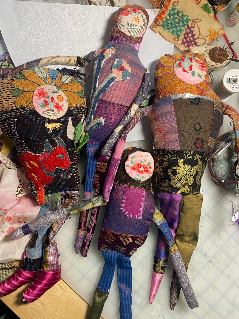
In prior posts, I have been talking about healing my inner child by making a Spirit Doll. As is my custom, I then made several. 🙃 I find that making more than one item helps me to refine my techniques, while it extends my enjoyment of the task, because of the time spent, multiplied. And, then too, this creates meditative and quiet moments with self.
Right now, I am using this meditative time to consider where I need help rescripting the dialog between myself and my inner child. I have been nonchalant and somewhat stern with my inner child up until now. My work now, is to become soft and receptive to my inner child’s needs and not be dismissive. I enjoy the work of Fei Wyatt on Instagram, who helps me learn gentle parenting skills to use with myself. 🌿💕
Another tool I have been nurturing is found within maintaining an altar. It feels especially important to invest in the divine, right now. Each day, before I begin working, I stand before my altar, and I breathe deeply. I speak to my inner child, asking them how they feel, I ask if they have needs, and if they answer, I provide loving support. I may light a candle as I do this. I will often touch small items on the altar, a crystal, a figurine, my magical items. This helps me create an intention for my time.
As I work, I enjoy herbal teas. My current favorites are rose petal and chamomile, which I buy loose and combine myself. ImmuniTea and Rooibus are some other favorites. I enjoy using honey as a sweetener. I like unpasteurized raw honey, to be specific. Recently, I have begun to use a dash of elderberry juice in my tea, to soup it up a little. Elderberry is rich in antioxidants and a great food to ingest during cold and flu season.
I am leaning into the flower, rose, and it’s spiritual meanings, as I explore the needs of my inner child. Because of this, I have a bottle of rose water at the ready. At any moment, I might grab the bottle and spray the air over my head! I enjoy the moment as I do. I bought a nice rose oil, and I sparingly dab it on my wrists some days. I thrifted a sweatshirt with large, rambunctious roses printed on it, I admit, I would not normally wear this sort of thing, but heck! Things change and so do I. I have a rosy disposition! 💐
Screenshot
Additionally, in making these Spirit Dolls, I have uncovered some lovely stash that really hasn’t seen the light of day, in a very long time. I am delighted and gratified to find Milagros, velvet flower petals, beads in sizes pony to seed, ribbons. Really great stuff. Oh, and earth magnets too. This is wealth. What Spirit Doll doesn’t need earth magnets embedded within, in order to have detachable magical items placed on their bodies?
And while I am here, cultivating a sense of gratitude, leaning into delight and being receptive to joy, are key components to life and artistic expression. This is the space where surprising choices elevate the message. Gratitude is a tool that can cultivate good cheer and help to keep the door open to wonder, joy and delight. It helps us stay focused on goodnesses, in the here and now.
So, I have to ask, what creative tools do you possess that help you to meditate, gain mental clarity and express yourself? That need not be art or craft related. I find outlet in exercise, as well. I would just like to know, how do you engage in ritual making, meditation and whatever it is, that is your creative expression? I would really like to know.
There was a time when I thought working with my inner child was trivial, embarrassing, woo woo.
No more.
I realize now, that, when I, who am an adult, have big emotions, Little Melly is right here, hot on the trail of an injustice, that she is trying to help me avoid. Little Melly is vigilant on my behalf. Concerted. It makes me laugh, now. Now that I know what is happening.
Previously, I would have tried to stifle my inner child’s response to overwhelm. To be ‘the adult in the room’. I have learned, this technique does not work for me. Instead, what does work, is gentle reception. Acknowledgment of how I am feeling. Actually feeling the feelings, so it gently wafts away.
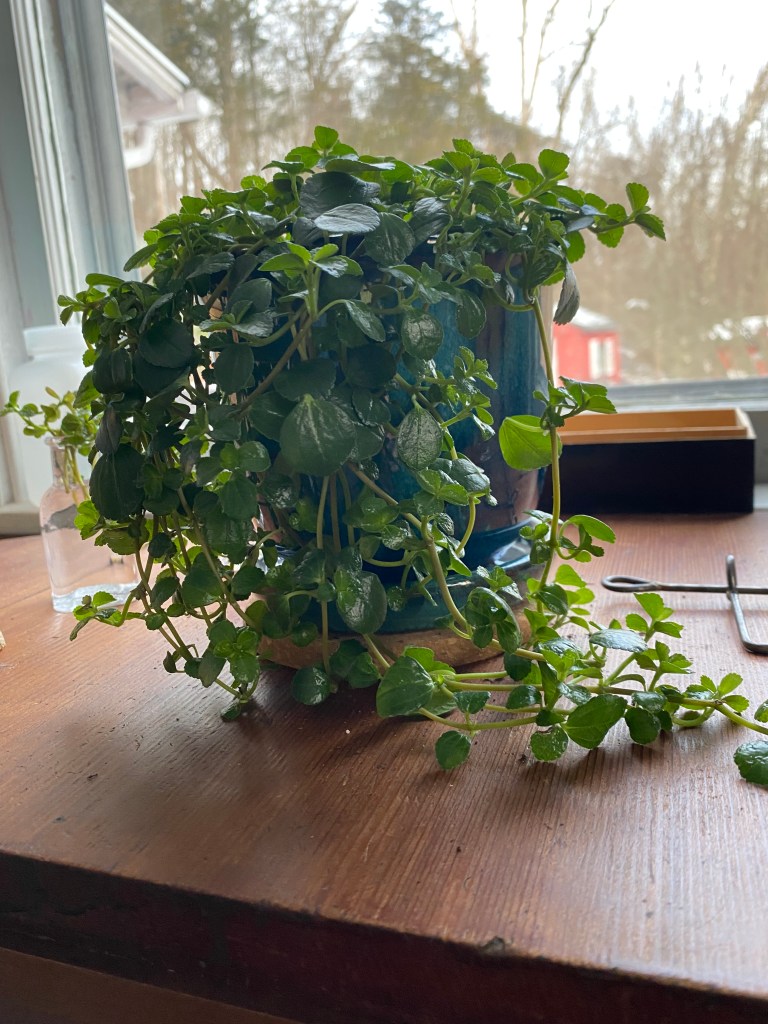
I am mourning the loss of my Mother and my family origin. My inner child needs support right now. So, I went to the plant store and bought a plant or two. I am going to learn to care for and love my plant. I am going to be attentive to its soil, and learn what dry soil feels like. I would like to grow and support these plants well into the future.
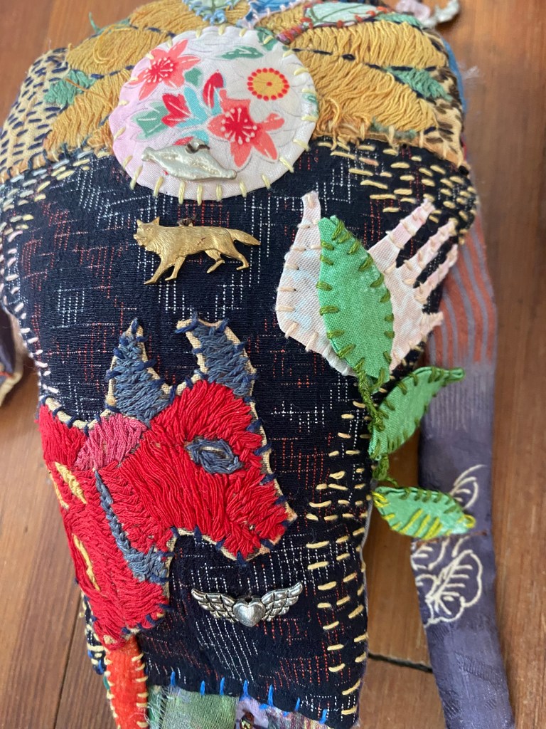
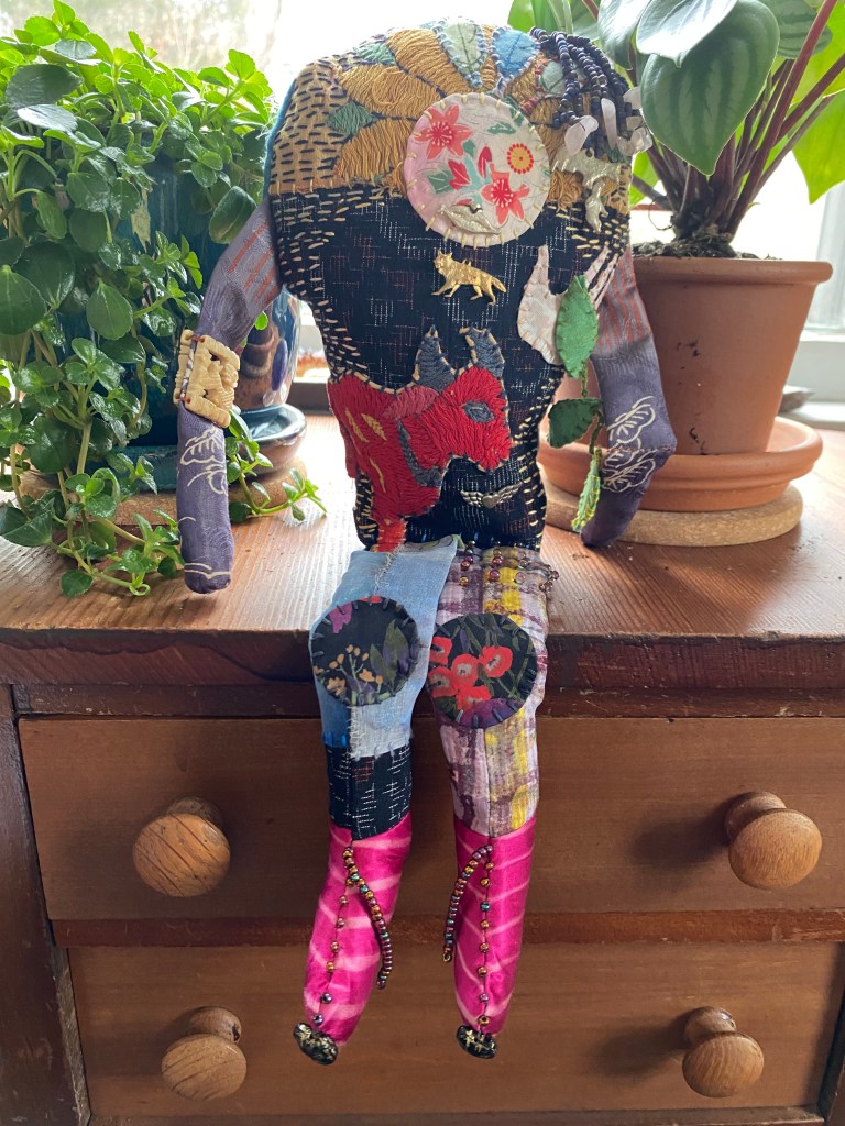
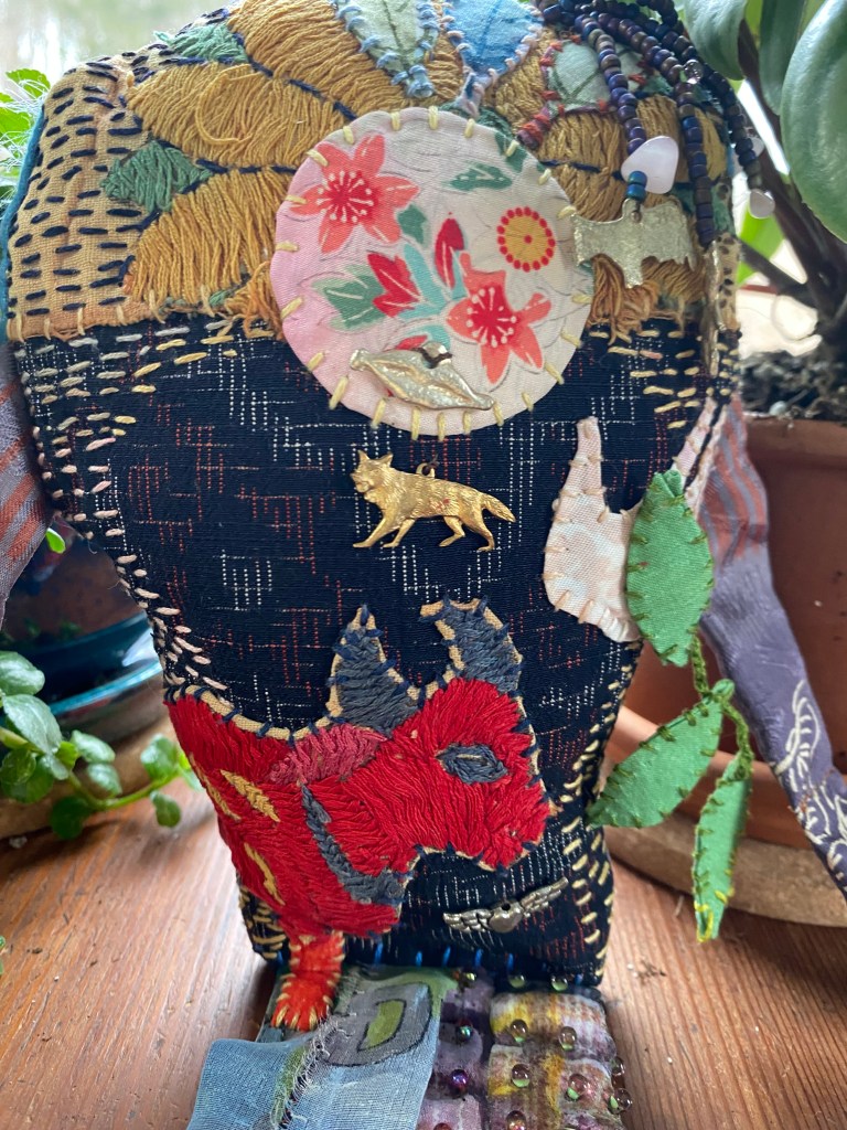
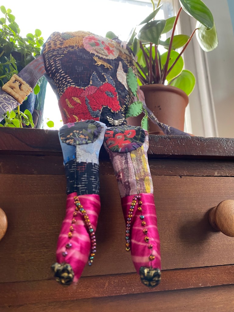
I am also making my inner child a spirit doll. This doll is in progress, but coming along quite nicely. I am imbuing it with as much magic as my needle and threads can muster. I have sewn an earth magnet into the hand appliqué, so that I can magnetically apply bits and bobs to the dolls body. I have been able to use some Milagros, applied rose quartz beads to its hair, I have sewn cat face beads onto the dolls toes. Its boots have beads trailing up to the ankle, ending in a single beaded tassel, I am calling this a tail.
My inner child’s spirit doll features a red yak. Yak are very interesting bovine animals. They live at high altitude, they can be quite rambunctious, and they have belly fur that acts like pom-poms. And also, they have horns. Yaks are resilient and steady creatures.
Ages ago, my Mom made me a rag doll out of rust colored, wide wale corduroy. It was filled with nylon stockings and cotton balls. I loved this doll, I would suck my thumb and scratch the corduroy, to put myself asleep. I went to nursery school with this doll. I also used it to attack my brother and father, for infractions I do not remember. The doll became known as Attack Baby. I wish I still had that doll.
Now, as I move into this new era, one where my Mom is no longer walking this earth, I seek to connect with my inner self, or inner child, in new and different ways. I offer the calm consideration of learning to care for plants, our world’s most spiritual beings. I offer the magic of a spirit doll, in the hope of gathering all the joys and tears that are yet to come. Little Melly, I will take it from here. You are in good hands. Not to worry.
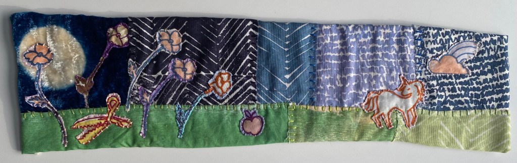
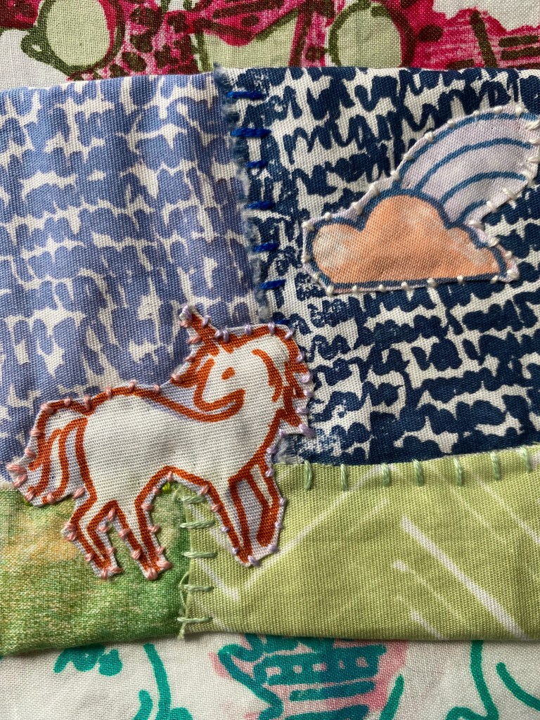
Many years ago, I turned to social media and asked, ‘When you think of unicorns, what do you think of?’ The response was tremendous. Little did I know about unicorns, up until this point. I have since this moment, become an aficionado. I know both facts and fiction about unicorns, I have participated in high quality research about unicorns, their surroundings, particulars, likes and dislikes. I come upon new facts, fairly often. In fact, the comments section of this blog is a great place to leave tips and lore. If you did that, my knowledge base would expand.
That contact brought to my attention, unicorns (this is an indelicate fact, and I am just preparing you to take in this information), poop soft serve ice cream. We all love a nice soft serve ice cream cone with the cone and all. Unicorns are also related to, use or otherwise hang out near, bubble gum machines, poppies, apples and rainbows. Unicorns will begin to glow, in the sunlight, because they grow aurora borealis feathers on their butts, as they mature. These beautiful feathers glisten and shift the colorful rays of light that bathe them.
And, here is my most fantastical finding about unicorns. I am imparting this information because I would like for you to be prepared. In this instance, like so many others, preparation is key. So.
When entering a forest of known unicorn habitation, you must, carry pinking shears. If we were playing Monopoly, one might say, Do not pass go. Do not collect $200.00. Just bring the pinking shears. Which sort of begs the question, What do you do with the pinking shears? I am unsure. There are corners of the internet that are best left untended. I am merely a messenger. 🦄🌈❤️🔥
Asking this question lead to the creation of an entire fabric line. I have two unicorn prints, a soft serve ice cream print, a pinking shears print, a feather print. There are probably more that I have forgotten about. The unicorn landscape you see above is part of a series that I am calling, The Unicorns are Coming. Thus far, I have made 7 unicorn landscapes, and I have three backgrounds made for even more. This is the first time that I am using indigo dyed rayon velvet in my work, which I consider to be a moon. So long as I dyed or printed it, I am using it.
In creating narratives, I find that unicorns come through, they provide a plethora of really, quite magical options. They leave tasty treats around. Their forests contain poppies, feathers, and some pointy trees too. I try and place a pair of pinking shears in every forest that comes to fruition. Sometimes floating bubbles of love follow the unicorns around. Not all the time.
I have found, in researching unicorns, one must be quite attentive to catch all of the details.
If at all interested, I have created a three part zine called The Motif Makers Zine. It highlights how to transform creative ideas into textile designs, while imparting fantastic Unicorn lore! I think you might like it!
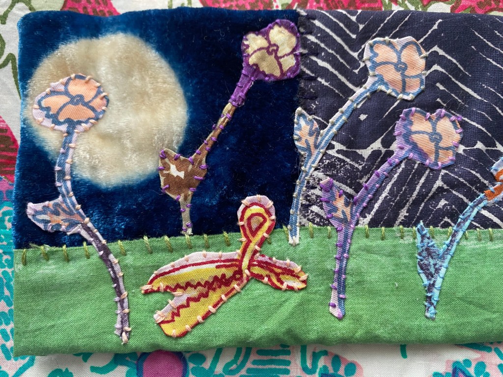
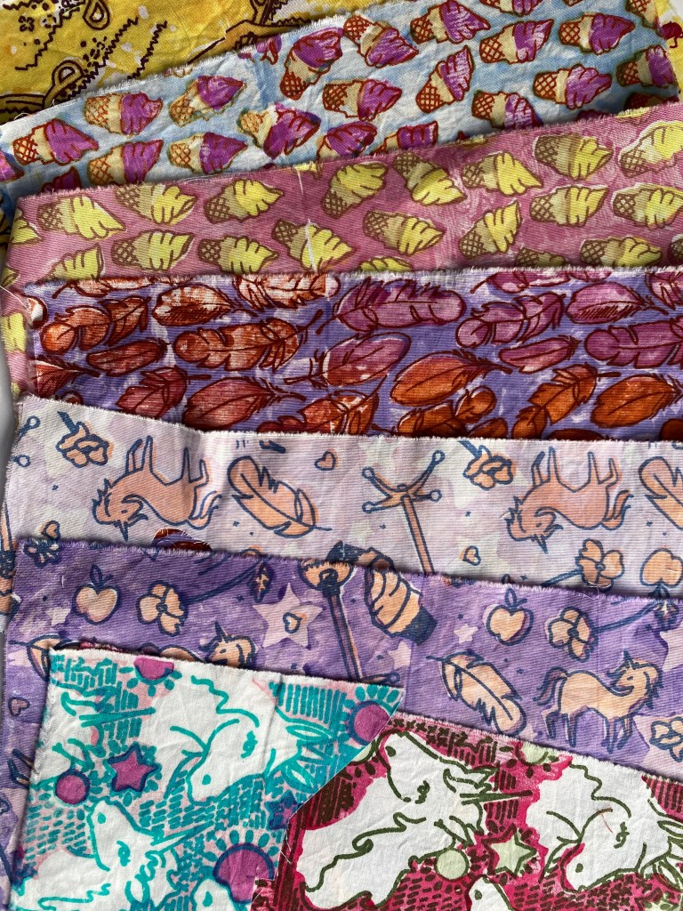
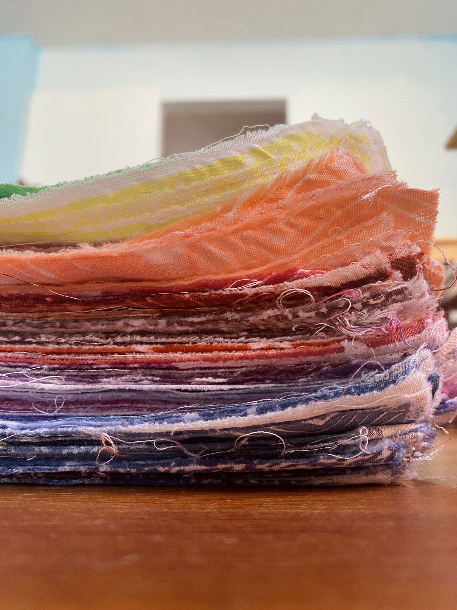
A few years ago, when we first bought this home, I began working with appliqué, using my own hand printed cloth. At the time, I was working small, because we were having construction done, and the table that was available to me was limited in size. I had been using the techniques reviewed in Playful Fabric Printing to create a new color triangle. The triangle we use in PFP has 28 colors in a gradation of 4 values, for a total of 112 colors in all. The cloth I had printed, up till that point, began to pile up. And I had to ask myself, what I was printing all that cloth for. I do understand the incongruence of working small and using up gads of cloth!
Anyway. The primary MX colors I have used for this triangle, are Strong Orange 202, MX Grape 801 and MX Deep Navy 414. These choices, as you might imagine, are skewed away from the traditional red, yellow and blue you might expect of a color wheel. In my current grouping, Strong Orange stands in place of yellow. MX Grape stands in place of red, and Navy, an earthy, heavier blue, anchors itself within this triangle in the blue position.
I am now, more than half way, from completing the stated mission. Each time I mix three new colors within this triangle, I print single color prints. I have a fair amount of single color prints at this point too. I have blown out most of the screens in my collection and I have created a few new single color prints ready to be burned.
(Honestly, I cannot wait to print. Printing is, by far, the most favorite thing I do. I love creating repeats. I like printing yards at a time. And, to be fair, steaming and boiling isn’t my favorite part of ‘doing the thing’, but who cares, there are yards of new cloth at the end of doing it. My own! Hand-printed cloth!)
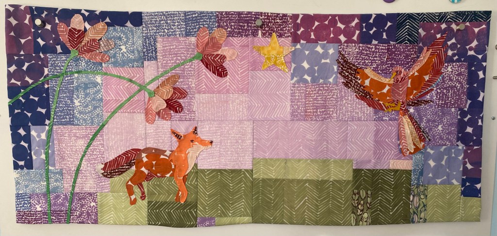
As I created the repeat for each of these single color prints, I took into account, how much white you might be able to see. White can really POP into the visual space, as you see in the circle print, found mostly in the sky of the above the unfinished, Fox and Bird artwork. When I first started using my fabrics together, I wondered if there was too much texture, too much white. I questioned if the patterns vied with one another in an unsettling, or mishmash way. I don’t know. I guess, I don’t care. I have so many single color prints in my possession and I need to make something out of them! I try to use the POPs of white to my advantage within the motifs and placement within the patchwork. And I like to vary the amount of white that comes forward in my textile designing. Small medium and large. 🙂
When I walk, I like gazing into the canopy, whether leaves in summertime or bare branch in winter, I like to experience the sun dappling and its warmth touching every bit it can. In looking through the trees, seeing the light, there is so much depth and camouflage about it. There is no one thing, leave, branch or trunk, that stands alone.
That is what I see or feel, when I use all of these single color patterns, together. That interaction of light, color and value and depth.
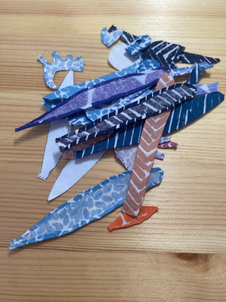
The narrative within this Fox and Bird piece has not come to fruition. Now that it is basted, I will let it sit and ask it what it wants. I still think the bird needs something MORE, something dark? Grr. There is a part of me that wants to see a diamond between the Fox and Bird. I have definitely been influenced by the apple in this piece. Here is a pile of the Bird rejects so far.
In the meantime, my little cat LuLu started to think this piece was her table blanket. She bullied me, one day, as I was trying to get the basting done. I did not want her sitting on the piece. And, the Lu just wanted to sit on my thing, it was her thing. It was usually covered with tracing paper and Lu likes tracing paper too. I have finally gotten everything basted, so this is no longer a temptation. The piece can now stay on my design wall and LuLu can have the table back. Phew.
I have been a journey of self love and acceptance, as I hope we all are. Some days, I would call it radical acceptance.
As I mentioned previously, my Mom recently passed away. My Father passed a few years back and my sibling is no contact. I understand why my sibling went no contact and I am proud of them for it, even if it pains me. So, a very important aspect of my life has come to a close. In going through my childhood photos, I see my teen Mother. I see my addicted, biker-gang Father. I see the dysfunction I was raised in. I see my childhood best friend, whose Mother was murdered by her own Father in the two family home I grew up in. It is more real to me now.
I have been fearful of this moment for a long while. I knew what I would see and was hesitant to allow myself to feel the grief of honest assessment.
But. I have done good work on myself. I am able to hold the grief that my childhood was not what I needed, or wanted. I am able to hold the grief that my Mother deserved better, and was unable to attain that for herself. I am able to see my broken Father and understand the impact of his unhealed trauma.
For lack of emotional safety, I have for years, made myself palatable, smaller, less. I have been a people pleaser who overcompensates emotionally, in order to maintain relationship. I have come to understand that this is an avoidant behavior, a protective behavior. This behavior helped me survive.
I love all of these people. We had good times, I cannot deny this. We did our best by one another. Many of the acute negative behavior subsided and allowed a portion of contentment. I will miss my Mother and Father. I wish all the best for my sibling.
And, I am ready to put this part of my life behind me.
My task now, is to continue to discern what is true to me. To question my triggers and slow myself down, so that I may act in accordance with my own best interest.
I choose me. I choose dancewalking. I embrace my childlike curiosity. I invest in my creativity, which is meditation in action. I am no longer afraid to bring all of myself to relationship. I trust that I can handle rupture and work toward repair. I am accountable to myself and others. I no longer fear abandonment when I use my voice. I am a cycle breaker.
This is a sad place, a place of mourning and deep introspection. But, I begin to feel myself turning toward me and I am proud, glad, able. This is a place of great hope and renewed meaning. This feels like a cosmic request for change and I am ready.
It is time to make, More Art.
I have updated my Etsy shop with many small works and invite you to check it out. I would like to remind you where to find me on social media, like Instagram and also, my Facebook Artist and personal accounts. I am grateful to all who choose to come here and read my introspections. I look forward to rebuilding community of my own making. Please don’t hesitate to comment, to make suggestions, or to subscribe to this blog.
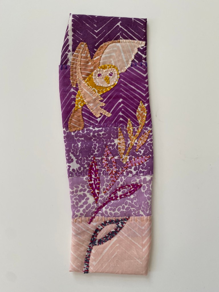
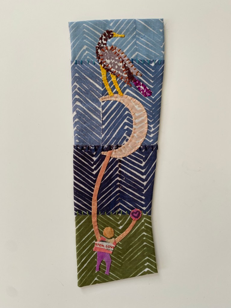
Hello, my good and burgeoning readership! I am happy to announce an Etsy Shop update. There are Daisy Gazers, Hand Holders, Owls and more!
My current small works are an exploration of story telling with birds, daisies and natural elements, amidst a fiesta of color and texture. All of the fabrics in these works are hand printed by me and the designs are of my own creation. (BUT, there is one caveat. When I create the little people, I use commercial prints for their shirts and clothing! Which somehow made sense, artistically.) It also makes sense, when depicting people among natural elements that their arms might really stretch into the atmosphere, striving for connection.
When I begin creating each piece, a story emerges, birds will weigh down daisy stems, which are quite obliging! Appreciating having something to do and glad that their petals are being admired. When I first began working in this style my pieces were quite small, and over time, I have begun to make bigger and bigger applique motifs.
I truely hope one of these stories tickles your fancy. head over to my Etsy to check them out. You will also find hand printed pocket squares, patches and my Zine. 🌿
I am happy to be back and it is exciting to poke around and see how many folk are stopping by, and to get some comments too. It feels so nice.
Soon, I will show you an applique piece I started where the motifs weren’t nearly as big as I want them. 🤩🥰 Thanks for stopping by.
A friend through Facebook reached out and asked if I would make an ornament which depicted both an American Flamingo and a Sand Dollar. I jumped at this request.
When I hear the word, ornament, I think of a dimensional object, hanging from a loop. I upcycled some packing cardboard to create the base. I wrapped the base with a commercial print which extols the virtues of Lavendar.
The inspiration for the ornament
In looking at images of American Flamingo, their legs go on for ages! They make me want to use the word, gams! American Flamingos have great gams! 😂🤩 After that, it just made sense that my flamingo would appear to, almost, stand upon its own head.
Once I got the Flamingo sewn to the base, it only made sense to suspend what appears to be a Sand Dollar. It’s little cubby was asking for something fancy!
A drawing of the bird along with the fabrics to depict it.The inspiration for the ornamentThe base or structure of the orament
These last few months have been challenging. I first lost my job and income, then I lost my Mom. My father passed away a few years ago and my sibling is no contact. This part of my life is coming to a close and a profound shift is occurring.
I feel as if a reordering is occurring, from all directions. While going through my Mothers belongings, I came across a complete set of report cards for myself. They indicate that I have dyscalculia and Dyslexia, two learning disorders which, in retrospect, I can now see, have affected two of my most recent employment scenarios. I need to find some resources to help support myself in this department. I am unsure as to what to do about this, but it is on my agenda.
In the meantime, I long to teach art technique again. My current deep dive, artistically, is appliqué using my own hand printed cloth. I am wondering if I can run a video class about applique. I would happily create some kits of my fabrics for purchase, though it would not be a necessary purchase, gradations of your own cloth could be used as well.
Above, you will see, I am designing an ornament featuring a pink flamingo, otherwise known as American Flamingo. What I like about these birds are thier spindly legs and knobby knees. Their bulbous beaks aren’t too shabby either. I like falling for a nice bird!
Thanks, Beth, for asking me to make an ornament for you. I hope you will like what I come up with. If anyone would like to commission even the smallest of works, please ask, I am open to the work. I wonder if it is possible for me to create part time work for myself teaching art technique and selling small works. I have a fair amount of evidence that supports this idea.
I will tell you what though. I am glad I opened up about my experience on Facebook, recently. The post received 100s of comment and really allowed me to feel cared for. It emboldened me to remember that I have salable skills, and can create an employment path that is not traditional.
It has literally been years since I have utilized this space. The last time I used it, I lived in New York City. It was during Covid 19 lockdown. I was making some really comfortable masks, where all of my supplies were donated by my community. I had a two for one deal, where every mask bought, supplied a mask, to a local essential worker. It was, truly, an amazing endeavor. I felt such grace to replace my income, to help my fellow city dwellers and to interact with my online community.
Since this time, I have moved to the suburbs, found in person work. I have also reorganized my engagement with social media. My use of it has dwindled quite a bit. Where it used to be fun and generative, it is now a place where I hesitate to involve myself. The billionaire owners have revealed their intention to use the space to confuse folks with news that is not worthy, charge for every interaction, and use every post and picture to feed insatiable artificial intelligence.
I have begun to long for the early internet days, where blogs kept us connected, as artists, who wanted community. I do not know if this is possible anymore.who reads blogs? But, here I am, considering the possibility. I have been daydreaming of creating an online appliqué class. I would like to start selling through Etsy again. I long for the connection I was able to create by maintaining a blog. Am I off my rocker?
The above artwork is part of my Unicorn series, which I am calling, The Unicorns are Coming. All fabrics are my hand printed cloth. Back in the day, I went to Facebook and I asked folks, ‘ What do you think of when you think of Unicorns. The responses I got were taken into consideration and I created a collection of fabrics that include motifs like, poppies, soft serve ice cream, apples, bubble gum machines, rainbows, and more. This endeavor changed the trajectory of my creativity and I have been immersed since. I feel even more gratitude! I wonder what might come next.