The Playful Fabric Print-Along has been a boon and a learning experience for me. Today I share my work, here on my blog and also in our Facebook community page, Playful Fabric Printing. I encourage you to join our community page to see what we have been up to! The Coupon Codes are to be found in this group and you still have time to use them!
Anyway, back to the ‘boon and learning experience’.
Above you see the background layer of the NYC MTA Subway multicolor set with a thin layer of two shades of thickened blue dye. This application of the two colors, in gradation-Light to Pale, adds visual interest to the sky in the design. It is as if the sky is depicted at dusk, at least that is how I like to think of it.
But really. Printing this background layer in this manner breaks up the background, which really colors a large portion of the design.
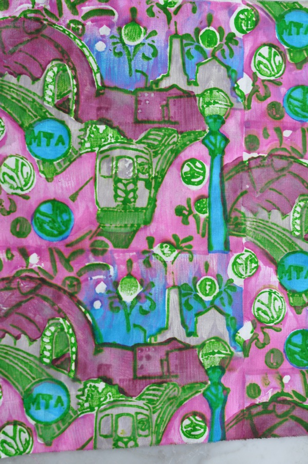
A greater learning experience for me, was in printing the carved rubber layer in Dark, Color #10, what appears brilliant green above. This green is a lighter value of Dark than many of the colors in the color triangle (Playful Fabric Printing, page 48).
This fact made me think about and use color a bit differently than I normally would. I did not want to overpower the green or obliterate the carved detail of that layer. And this criteria encouraged me to print closely related values, Light with Pale, Light with Medium and so on.
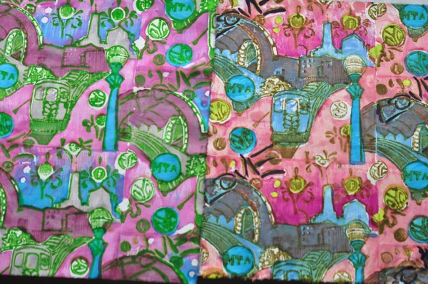
Thus far, I have printed 10 NYC MTA Subway prints, and I think I have just about figured out a methodical approach to both coloring and printing it, which is especially helpful when Speed Printing.
In printing each one, I applied color judiciously. I began by coloring the subway itself, which was an easy choice, grey. I pulled a Pale and a Light grey from my mixed dyes. Knowing I would be overprinting the shading in the City Hall tunnel area of the print, I made the decision to print that layer one shade darker than the subway. It quickly became important to me that the MTA logo be colored blue.
And then the coloring of the word ‘love’ became a challenge. So, I worked and reworked the layers pertaining to the word and figured out how to color it to my liking. Putting words into a design is interesting and difficult. I am unsure I nailed this aspect of the design, but I cannot remove it either, so I am learning to color it to my liking. In my imagination this is graffiti, it also alludes to the 1970’s I love New York ad campaign. And I do enjoy riding the subway, so it fits.

It was great fun to combine the Printed Village NYC MTA Challenge with the Playful Fabric Print-Along. And please join our Facebook community! Folks are sharing great work in this group! Come see.
I do hope my design wins the challenge, though, I may delete my current designs and upload better! Haha!
Discover more from Melanie Testa
Subscribe to get the latest posts sent to your email.

I have loved following along as you work through your design process. I’ve learned so much and thought about things I never would have thought about – like shading and graffiti. I’ve always just printed and never liked what I created. I now know why. I need to treat the cloth like a journal page instead of racing ahead in my mind to how it will look in a project. Thank you!!! xoxo
LikeLike
Jeannie. I have begun constructing personal ideals in what to print and how to bring those prints to completion in a quilt (or finished project). I have found, the criteria I use to create the cloth is changing, accordingly. Printing cloth and using that cloth are two divergent paths but also closely entwined. I like my quilt tops to have visual texture differences. The recent Lace Swirl Zig Zag Quilt being a good example.
LikeLike